作者 | Lukas Frei
编译 | 史提芬先森
**原文 | **How to Use ggplot2 in Python
简介
由于严格执行图形语法,ggplot2 提供了一种极其直观且一致的数据绘制方式。 ggplot2 的绘图方法不仅确保每个绘图都包含某些基本元素,而且在很大程度上简化了代码的可读性。
但是,如果您是 Python 的频繁使用用户,那么由于 matplotlib 或 seaborn 等流行绘图库中缺乏标准化语法,因此实现图形语法可能会非常具有挑战性。 如果您仍想使用图形语法,那么 Python 包 plotnine 为您提供了另一种选择。
图形语法
如果您不熟悉图形的语法,这里有一个快速概述:
的主要组成部分") 如您所见,从您的数据开始,有几个组件构成了图形的语法。在确定要可视化的数据后,您必须指定您感兴趣的变量。例如,您可能希望在 x 轴上显示一个变量,在 y 轴上显示另一个变量。第三,你必须定义你想使用什么类型的几何对象(geometric object,简称 geom)。这可以是从条形图到散点图或任何其他现有绘图类型的任何东西。
如您所见,从您的数据开始,有几个组件构成了图形的语法。在确定要可视化的数据后,您必须指定您感兴趣的变量。例如,您可能希望在 x 轴上显示一个变量,在 y 轴上显示另一个变量。第三,你必须定义你想使用什么类型的几何对象(geometric object,简称 geom)。这可以是从条形图到散点图或任何其他现有绘图类型的任何东西。
所有的组件中,前三个组件是强制性的。没有数据,就没有什么可绘制的。没有轴定义,也没有什么可以绘制的。最后,如果不定义几何对象,您只会看到一个空坐标系。构成图形语法的其余组件是可选的,可以它们的实现以改进可视化。分面(facet) 指的是子图(subplots)的规范,也就是说,在单独的图中,将数据中的几个变量挨个绘制出来。统计转换主要是指在绘图中包含汇总统计信息,例如中位数或百分位数。坐标描述了可供您使用的不同坐标系。最常用和默认的坐标系是笛卡尔坐标系。根据您要绘制的数据结构,较少使用的坐标系(例如极坐标系)可能会提供更好的数据可视化方式。最后,主题提供了多种选项来设计绘图的所有非数据元素,例如图例、背景或注释。
虽然有许多可视化图形语法的方法,但我特别喜欢我在上面创建的那个,因为它暗示了这些层的可加性以及它们相互构建的事实。如果您曾经使用过 ggplot2,那么您就会熟悉其语法中的“+”,它象征着上述相同的想法。
plotnine
plotnine 是一个 Python 包,允许您使用实现图形语法的类似 ggplot2 的代码。 通过这样做,就像在 ggplot2 中一样,您可以将数据专门映射到构成可视化的可视对象。 这使您能够提高代码的可读性和结构。 虽然您可以将 matplotlib 的样式设置为 ggplot,但您无法像在 ggplot2 中那样在 matplotlib 中实现图形语法。
安装
在开始之前,您必须安装 plotnine。 与往常一样,这样做有两个主要选项:pip 和 conda。
# Using pip
pip install plotnine

# Using conda
conda install -c conda-forge plotnine
绘图
安装了 plotnine 之后,就可以开始使用图形语法绘制图形了。让我们开始构建一个非常简单的绘图,只使用三个必不可少的组成部分:数据、aesthetics 组件和几何对象。
 如您所见,语法非常类似于 ggplot2。首先,我们指定数据源。在我们的例子中,我们使用的数据是典型的 mpg 数据集。接下来,我们定义变量 “class” 将显示在 x 轴上。最后,我们说,我们想使用大小为 20 的条形图来可视化我们的数据。让我们来看看完整的代码和结果图:
import pandas as pd
import numpy as np
from pandas.api.types import CategoricalDtype
from plotnine import *
from plotnine.data import mpg
%matplotlib inline

(ggplot(mpg)         # defining what data to use
 + aes(x='class')    # defining what variable to use
 + geom_bar(size=20) # defining the type of plot to use
)
上面的代码将产生以下输出:
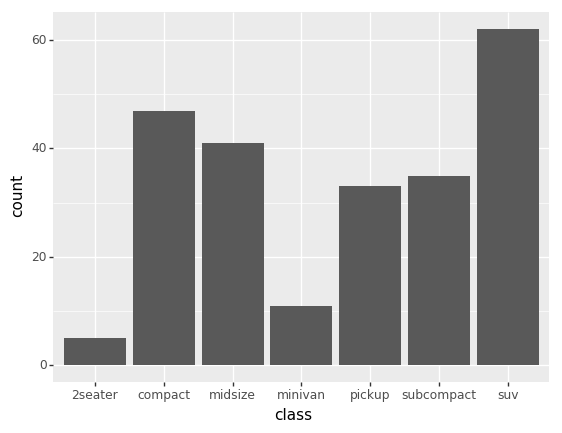 虽然这是一个好的开始,但看起来还不是很好。让我们用图形的语法的其他组成部分来美化我们的图形。
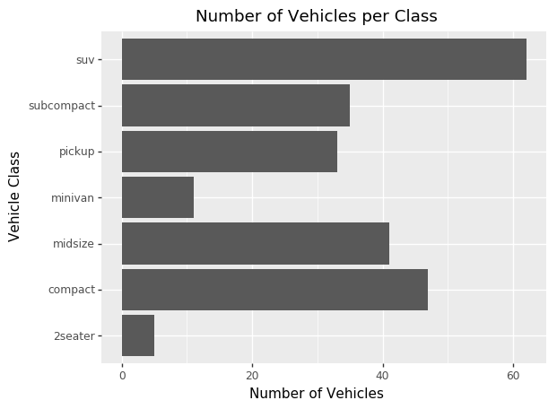
(ggplot(mpg)
 + aes(x='class')
 + geom_bar(size=20)
 + coord_flip()        # flipping the x- and y-axes
 + labs(title='Number of Vehicles per Class', x='Vehicle Class', y='Number of Vehicles') # customizing labels
)
例如,我们可以使用coord_flip()翻转坐标轴,并使用labs()自定义绘图和坐标轴标题以改进我们的绘图。使用上面的代码块,我们的绘图将如下所示:
绘制多维数据
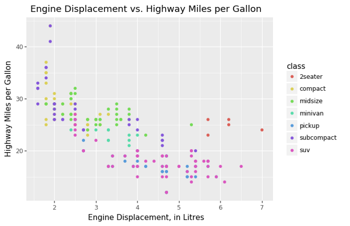
除了基本的绘图之外,您还可以在 ggplot2 中完成几乎所有可以做的事情,比如绘制多维数据。如果你想将三个变量之间的关系可视化,你可以在平面图上添加美学元素:
(ggplot(mpg)
 + aes(x='displ', y='hwy', color='class')
 + geom_point()
 + labs(title='Engine Displacement vs. Highway Miles per Gallon', x='Engine Displacement, in Litres', y='Highway Miles per Gallon')
)
将 color 添加到 aesthetics 组件中将会促使 plotnine 呈现一个在 x 轴上使用 displ(发动机排量,以升为单位)和在 y 轴上使用 hwy(每加仑高速公路英里数),并根据 class 变量为数据着色的二维图。我们还可以将几何对象切换到 geom_point(),这将为我们提供散点图而不是条形图。 让我们来看看会是什么样子:
总结
如您所见,plotnine 为您提供了在 Python 中利用图形语法的能力。这增加了代码的可读性,并允许您将部分数据专门映射到可视对象。如果您已经熟悉 ggplot2,那么您无需学习任何新知识即可掌握 plotnine。如果没有,这里是 ggplot2 网站的链接,您可以在该网站上找到更多关于图形语法和所有类型的可用几何对象的信息。